Dominant Colors with (not just) K-Means
As an artist, I am fairly curious about the colors I tend to use in my artworks. So the goal here is to find a small set of colors that visually represent an image.
K-Means with RGB
A common method to find dominant colors (the most represented ones in the image) is K-Means clustering. This method partitions some data into k disjoint clusters, where the points in same cluster are considered to be “more similar” than points in different clusters (according to some metric).
How does it work? The algorithm starts with a group of k randomly selected centroids. Then, it alternates between the two steps below:
- Each point is assigned to the cluster based on the nearest centroid
- The centroids are replaced with means of all the points in the corresponding clusters Once the assignments stop changing, we stop.
Python conveniently has K-Means implemented: we will use KMeans from sklearn. We will also use pillow for image processing. So, we load the image, then extract an array containing the RGB values for each pixel. Then, we feed the colors into the KMeans function to obtain the centroids.
from PIL import Image #pillow
import numpy as np
from sklearn.cluster import KMeans

#image to use
file = 'yourimagename.png'

#number of clusters
nclusters = 5

#load image and get colors
image = Image.open(file)
pixels = np.array(list(image.getdata()))

##fit KMeans and get centroids
kmeans = KMeans(n_clusters = nclusters)
kmeans = kmeans.fit(pixels)
centroids = kmeans.cluster_centers_
If you try processing a bigger image, you will notice that the code becomes slow. This happens because we have a really huge number of points to cluster, which impacts both on speed and convergence time. There are 2 solutions for this:
- Resize the image once you load it (you can use
pillowfor that) - Take a subsample of your pixels.
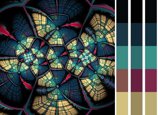
Back to business, we now got a list of 5 dominant colors for our image. But are those colors actually good? Take a look at the picture below: an artwork (Book of Moths by FarDareisMai) with the respective dominant colors obtained as described above.

It features small splashes of contrasting colors, but when we extract only 5 dominant colors, though, those hues are kind of lost and only a boring and muddy version of them appears in the selected five.
Visually, the colors I identify on that image are:
- pink
- a darker violet
- blue (light and dark)
- beige
- black
Ideally, for me, it would skip black and select the other 5 as dominant. When we use RGB, we sort of fail to get pink and violet instead.
K-Means with CIE Lab
Of course, we can just increase the number of dominant colors, but that is no fun. Lets try to somehow tweak it to produce an output that represents the whole thing better using the same 5 colors. My first idea to fix it was to do some sort of re-sampling, but the results were not good - while sometimes it indeed helped, most of time it would end up exacerbating some weird features.
And, as always, in case of doubt, switch to CIE Lab colorspace. Well, not really, to be honest I tried several other colorspaces and felt that it was the one that worked best here. To do the conversions, we will use the colour library, and then feed the results into KMeans.
import colour as cl

#converts from rgb to xyz
def rgb_to_xyz(p):
    RGB_to_XYZ_matrix = np.array(
        [[0.41240000, 0.35760000, 0.18050000],
        [0.21260000, 0.71520000, 0.07220000],
        [0.01930000, 0.11920000, 0.95050000]])
    illuminant_RGB = np.array([0.31270, 0.32900])
    illuminant_XYZ = np.array([0.34570, 0.35850])
    return cl.RGB_to_XYZ(p / 255, illuminant_RGB, illuminant_XYZ,
							RGB_to_XYZ_matrix, 'Bradford')

#converts from rgb to lab
def rgb_to_lab(p):
    new = rgb_to_xyz(p)
    return cl.XYZ_to_Lab(new)

#converts from xyz to rgb
def xyz_to_rgb(p):
    XYZ_to_RGB_matrix = np.array(
        [[3.24062548, -1.53720797, -0.49862860],
        [-0.96893071, 1.87575606, 0.04151752],
        [0.05571012, -0.20402105, 1.05699594]])
    illuminant_RGB = np.array([0.31270, 0.32900])
    illuminant_XYZ = np.array([0.34570, 0.35850])
    newp = cl.XYZ_to_RGB(p, illuminant_XYZ, illuminant_RGB,
							XYZ_to_RGB_matrix, 'Bradford')
    return newp * 255

#converts from lab to rgb
def lab_to_rgb(p):
    xyz = cl.Lab_to_XYZ(p)
    return xyz_to_rgb(xyz)

#kmeans
kmeans_lab = KMeans(n_clusters = nclusters)
kmeans_lab = kmeans_lab.fit(rgb_to_lab(pixels))
centroids_lab = kmeans_lab.cluster_centers_
centroids_lab = lab_to_rgb(centroids_lab)
The result is different: compare, below, RGB clustering (left) and CIE Lab clustering (right). We could say it is better even, if it wasn’t so dark.

At this point, I got tired and cheated. I used the clustering above, but once it was done, I re-calculated the centroids of all clusters, using a weighted average instead of regular average, with higher weights to light colors. The result is the rightmost gradient on the picture below:

The other 4 colors remain as previously, but at least the violet is better represented.
Different Clustering Algorithms
K-Means is not a must. There are other clustering algorithms, and there is no reason for us to not experiment with them. Also, there is no reason for us to stick to euclidian distances, to be honest. Maybe another approach would produce much better results?
We can experiment a bit with, for example, AgglomerativeClustering from sklearn. An observation: this clustering eats up much more memory, and is way slower than K-Means. You may need to resize or downsample your image even further to make it run.
from sklearn.cluster import AgglomerativeClustering

#convert to lab
pixels_lab = rgb_to_lab(pixels)

#fit clusters
ag_clusters = AgglomerativeClustering(n_clusters=nclusters,
					affinity = 'l1', linkage='complete')
ag_clusters_fit = ag_clusters.fit(rgb_to_lab(pixels))
#get centroids
centroids_ag = []
for i in range(nclusters):
    center = pixels_lab[ag_clusters_fit.labels_ == i].mean(0)
    centroids_ag.append(lab_to_rgb(center))
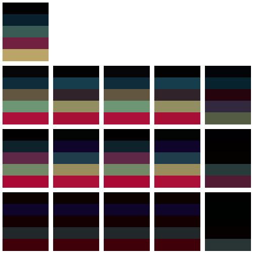
The AgglomerativeClustering method has a number of parameters, but here I will mess only with affinity and linkage. Below, there is a table of all possible combinations of this. The lines correspond to linkages, “ward”, “complete”, “average” and “single”, in that order. The columns correspond to different affinities, “euclidean”, “l1”, “l2”, “manhattan” and “cosine”.

“Ward” linkage leads basically to what we already had, while the colors obtained with “single” linkage are way too dark. “Cosine” affinity doesn’t work well either, so we are left with eight candidates. My personal favourites are the clusters produced with “l1” and “manhattan” affinities (which are sort of the same for our purpose), and “complete” linkage: the other ones either feature a light blue that doesn’t represent the image for me, or a bright dark violet, which I also feel is not accurate.
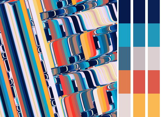
To make sure, we can look at another image (Disc, one of my own).


Here, the colors I see (and would like to see as dominant colors) are:
- blue (light and dark)
- white
- yellow
- red or orange
In this example, I honestly see no improvement over K-Means: with K-Means, we were able to identify all the relevant colors in the end (the task was easier, as we have 5 colors here, and not 6 as in previous example). Once more, “ward” linkage resulted in a very similar selection. As for other parameters, most have failed, except for “average” linkage with either “euclidean” or “l2” distances (which are basically the same for our purpose).
In sum, I feel that messing around with different clustering algorithms could improve a bit the K-Means results, but not significantly. We would also face model selection problems - although the idea of building a training dataset of dominant colors selected by a human user, and then training some sort of algorithm to identify those based on images and various clustering angorithms outputs sounds potentially fun. The main issue, I guess, is the performance: K-Means is relatively fast, and that is why it is so commonly used.